Unlock Science in Seconds
The Rise of Graphical Abstracts
Forget dense paragraphs and cryptic jargon. Imagine capturing the heart of groundbreaking research in a single, powerful image.
That's the magic of the Graphical Abstract (GA). In our era of information overload, where scientists are bombarded with thousands of new papers daily, GAs have emerged as essential tools. They transform complex findings into visual narratives, acting like captivating movie posters for scientific discoveries. This visual revolution isn't just about aesthetics; it's accelerating understanding, boosting visibility, and reshaping how we share the frontiers of human knowledge.
The Visual Revolution: Why Pictures Speak Louder Than Paragraphs
A Graphical Abstract is a standalone visual summary designed to convey the core message, methodology, and significance of a scientific paper at a glance. Think of it as a scientific infographic on steroids. Its rise is fueled by several key factors:
- Attention Economy: Scientists simply don't have time to read every abstract.
- Universal Understanding: Visuals transcend language barriers.
- Enhanced Comprehension: Complex processes understood more intuitively.
- Increased Visibility & Impact: Journals prominently feature GAs.
- Social Media Sharing: Tailor-made for platforms like Twitter and LinkedIn.

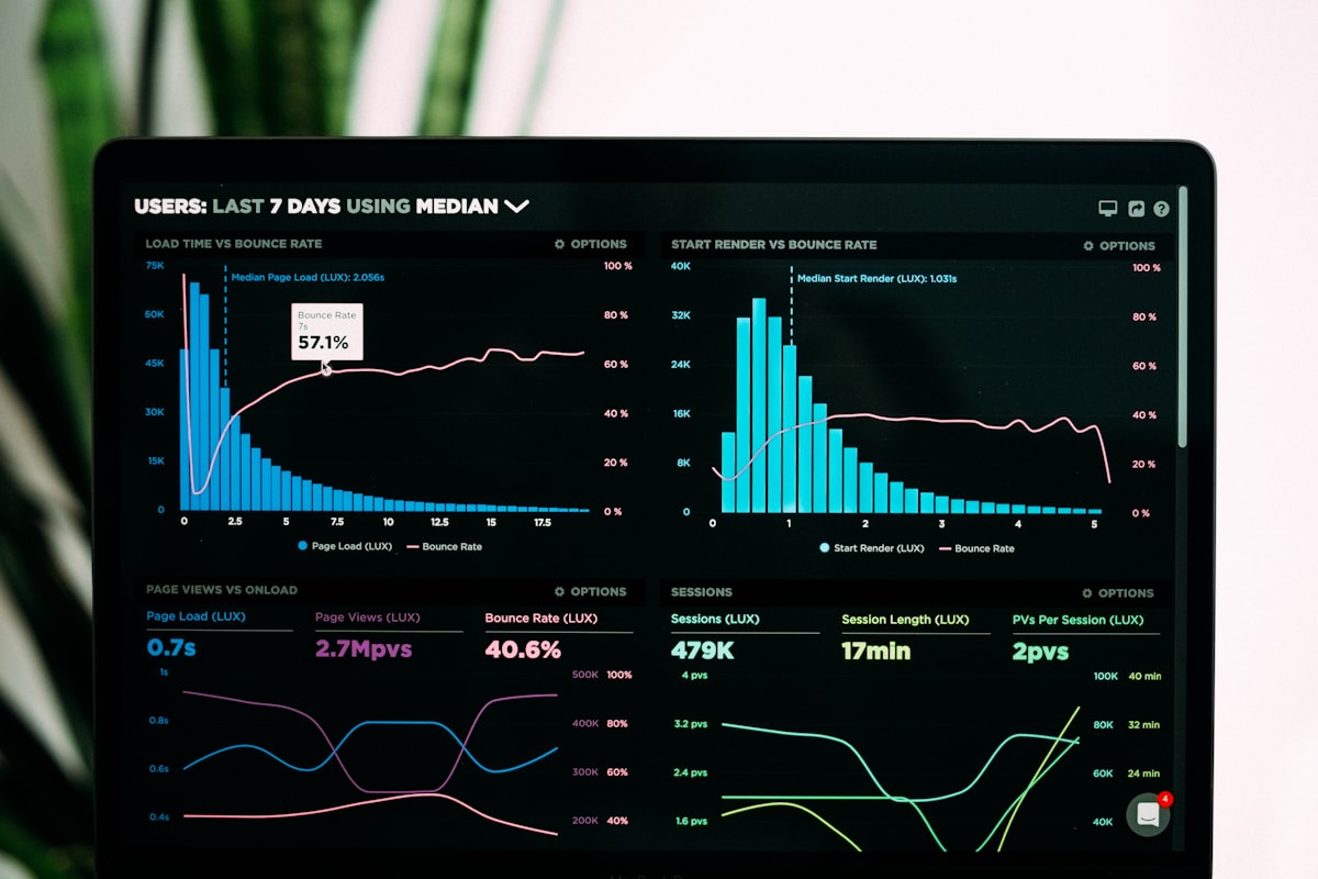
Example of effective data visualization that could be part of a Graphical Abstract.
The core concept is simple: distill the paper's essence – the question, the key experiment, the major result, and the conclusion – into a clear, concise, and visually appealing composition.
The Proof is in the Picture: Measuring the Impact of Graphical Abstracts
While the theoretical benefits are clear, does a strong Graphical Abstract actually lead to tangible results? A landmark study published in PLOS ONE set out to answer this question definitively .
The Experiment: Does Visual Appeal Translate to Scientific Reach?
Papers featuring high-quality, informative Graphical Abstracts will receive significantly more attention (views, downloads) and scholarly impact (citations) than papers with no GA or low-quality GAs.
- Paper Selection: 300 articles across biological and chemical sciences
- GA Creation & Classification: Professional illustrators created GAs when missing
- Control Groups: HQ GA, Added HQ GA, No/LQ GA
- Tracking: Views, downloads, citations over 24 months
Results and Analysis: The Visual Advantage Confirmed
The data revealed a striking and statistically significant advantage for papers featuring High-Quality Graphical Abstracts:
| Group | Avg. Views | Avg. Downloads | Relative Increase (vs Group C) |
|---|---|---|---|
| A (Orig HQ) | 4,820 | 1,150 | Views: +78%, Downloads: +85% |
| B (Added HQ) | 4,560 | 1,090 | Views: +68%, Downloads: +75% |
| C (No/LQ GA) | 2,710 | 623 | Baseline |
Analysis: Simply having an HQ GA, whether original or added later, dramatically increased visibility. Group B's performance nearly matched Group A, proving that adding a strong GA post-publication can significantly boost a paper's reach. This highlights the GA's role as a powerful discovery tool.
| Group | Avg. Citations | Papers Cited ≥ 10 Times | Relative Increase (vs Group C) |
|---|---|---|---|
| A (Orig HQ) | 18.7 | 65% | Citations: +52% |
| B (Added HQ) | 17.2 | 60% | Citations: +40% |
| C (No/LQ GA) | 12.3 | 42% | Baseline |
Analysis: Increased visibility translated directly into greater scholarly impact. Papers with HQ GAs were cited more frequently and were more likely to become "highly cited" within their field. This suggests GAs don't just attract clicks; they attract meaningful engagement from other researchers.
Conclusion: This experiment provided robust evidence that High-Quality Graphical Abstracts are not just decorative; they are powerful drivers of scientific communication, significantly enhancing a paper's discoverability, accessibility, and influence within the research community .
The Scientist's Toolkit: Crafting an Effective Graphical Abstract
Creating a compelling GA requires more than just PowerPoint skills. Here's a look at the essential "Research Reagent Solutions" for visual science communication:
Vector Graphics
Adobe Illustrator, Inkscape, Affinity Designer for crisp, scalable diagrams and layouts.
Image Databases
BioRender, Mind the Graph for pre-made, scientifically accurate icons and pathways.
Data Visualization
GraphPad Prism, Python, R for transforming complex datasets into clear charts.
Color Tools
Coolors, Adobe Color for harmonious, accessible color schemes.
Designing for Impact: Core Principles

- Focus: Highlight one key finding or process
- Simplicity: Avoid clutter; use whitespace effectively
- Flow: Guide the viewer's eye logically
- Visual Hierarchy: Make important elements prominent
- Accuracy: Ensure every element represents the science
- Readability: Use clear labels and legible fonts
- Engagement: Add creativity without sacrificing clarity
The Future is Visual
Graphical Abstracts have moved from novelty to necessity. They represent a fundamental shift towards more efficient, accessible, and impactful science communication.
As tools become more sophisticated and researchers become more visually literate, GAs will continue to evolve. We might soon see interactive elements, animated summaries, or GAs tailored for specific audiences like policymakers or the public. One thing is certain: in the bustling marketplace of scientific ideas, a powerful visual summary is the key to ensuring your discovery is seen, understood, and remembered. The next big breakthrough might just be hiding behind an equally brilliant picture.